Presentation and Visualization Methods
There are multiple ways of representing data that can be retrieved from underlying database or file system. Currently we have large number of enterprise business intelligence applications that can be used to present the data in terms of reports and dashboards. These reports or dashboards can be used by higher management to access the key performance metrics and analyze the data. These applications can also be used to drill down the charts and graphs to get the granular information.

Below I have described few data visualization for three industries.
- Transport
- Healthcare
- Sales
Transport
The below graph shows the Cost Efficiency of different modes of Transportation.
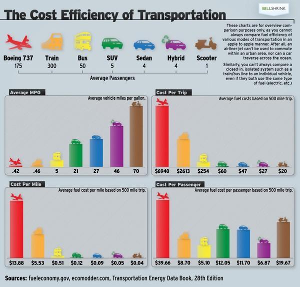
The above report shows 4 bar graphs representing multiple measures across different mode of transport. The first graph shows the average mileage coverage of different vehicles per gallon for different modes of transport. The other graphs represents the costs associated across multiple factors for different modes of transport. From graph 2, we can easily interpret that the cost per trip for airline mode of transport is highly costly.
Healthcare
Healthcare industry is one of the emerging industry that is using analytics to derive meaningful insights. Depictions can be derived using data such as medication usage or hospital readmissions by health insurance companies for understanding the customers in better way.
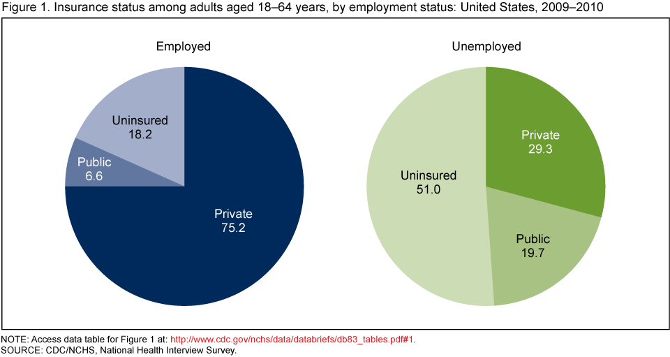
The above pie chart shows the insurance status of adults aged between 18-64 years as per employment status for the year 2009-10. Looking at the chart we can easily interpret that the most of the employed employees have private insurance. Whereas, 51% of the unemployed do not have insurance.
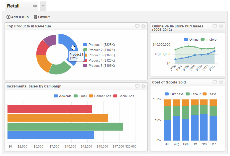
Sales
Every product company has a sales department that needs to measure the sales information across product, stores, and regions. There are multiple transactions having for products across locations every second, generating large amount of data. This data can be interpreted and visualized using visualizations tools such as Tableau. Below is a dashboard showing multiple reports in terms of different visualizations such as line graph, bar chart, stacked bar chart.
From the line graph comparing the online and in-store purchases we can easily derive that online sales of products have been increasing from past six years. Each dot on the line represents the sales value in dollars for a particular year. Using such graphs, it becomes easier for the organizations and management to uncover findings for strategic analysis.
In summary, we have seen how different visualizations can used be used across multiple industries by executives to interpret data and derive conclusions based on it. These visualizations also help them to make future strategic decisions. Therefore, visualizations tools such as Tableau and QlikView are currently being used and popular in industry.
References -
- https://www.klipfolio.com/resources/dashboard-examples/sales/sales-status
- http://www.usatoday.com/story/news/nation/2013/11/24/big-data-health-care/3631211/
- www.visualinformation.info
No comments:
Post a Comment